S&P Global · 2025–2026
S&P Global: An AI-Native Design System Engineering Adopted Into Production
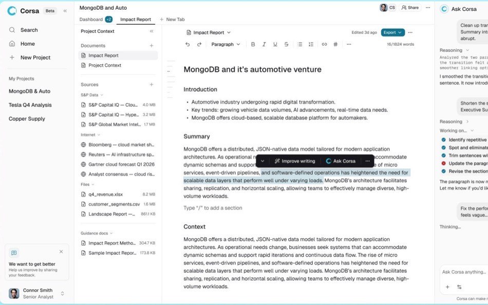
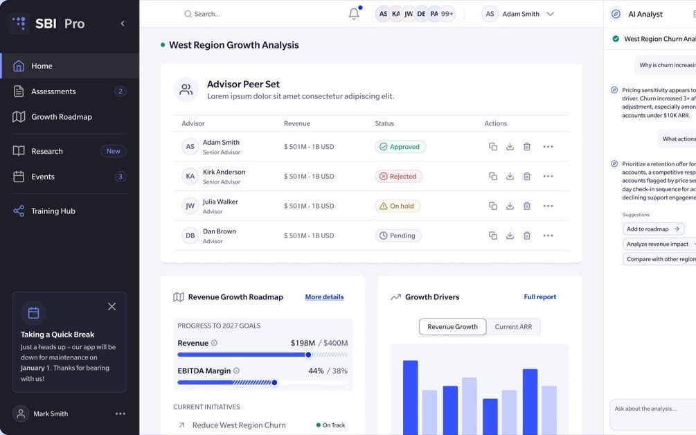
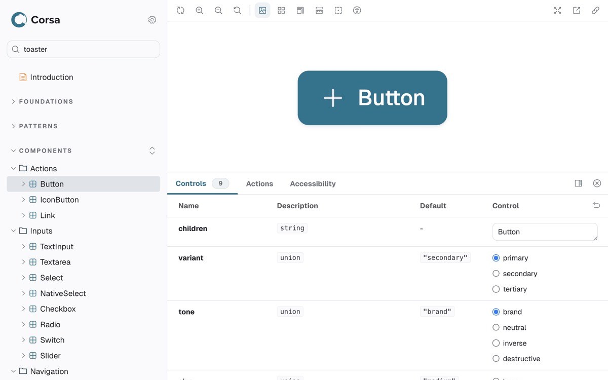
I designed an AI-native design system as an internal product for teams creating and evaluating product ideas. Designers, engineers, PMs, and analysts describe a flow in plain language and get a working React prototype built from real components, semantic tokens, and product context.
Failures
I designed the product experience of an AI research workspace for S&P Global analysts (separate case study) and built the system beneath it. This case is about the internal product used to create, test, and implement that experience.
Where the need showed up first
It started on S&P Global’s internal AI platform, where employees had published thousands of their own AI tools. Every one of them ran through chat, and the most-used ones were collecting structured inputs one message at a time, because form controls did not exist.
One employee tried to build a form-based tool there, with fields, an instant preview, and one-click regeneration. The platform could not support it, so she built it outside. Same model, very different experience. It was a UI creation problem, not a model problem, and it is the problem this system ended up solving: describe a screen in plain language and get working, on-system React back, with no React knowledge required.
The existing workflow had three connected problems:
- The Figma library had fallen behind the product.
- Front-end components were tightly coupled to backend services.
- AI-generated interfaces repeatedly diverged from production.
Designers could create static flows, but could not prototype with the product’s real behavior. Engineers had to reinterpret those flows during implementation. Claude could generate interfaces in seconds, but the output often used the wrong component APIs, bypassed semantic tokens, or missed required interaction patterns.
The goal was one shared system for design, product, engineering, and AI to create and evaluate product ideas.
Who it served
| User | Need | Existing friction |
|---|---|---|
| Designers | Explore realistic flows quickly | Static mockups and limited access to production behavior |
| PMs and analysts | Test ideas without writing React | Depended on designers or engineers for interactive prototypes |
| Engineers | Review behavior and implementation earlier | Received static handoffs and reinterpreted design intent |
| Claude | Generate UI from current product rules | Relied on incomplete or outdated documentation |
Four failures that kept coming back
I reviewed prototype sessions, inspected recurring corrections, and compared generated output with the production system. The same four failure modes appeared again and again.
Guessed APIs
Claude used props a component does not support. Broken behavior, and more review.
Invented components
Claude referenced components that did not exist. Empty or unusable output.
Hardcoded values
Generated code bypassed semantic tokens. Theme and brand drift.
Missing patterns
Required structure was left out. Fragile interactions and accessibility issues.
Setup added more friction: projects took 15–20 minutes to configure, users had to know which components existed, and product context had to be explained in every session.
Drift
Documentation first, and why it drifted
My first version used written component contracts. Each Markdown file described accepted props, required patterns, and common mistakes, with routing rules, context files, and a reusable prototype repository around them.
The output improved, but the contracts drifted when the implementation changed. A renamed prop made the documentation wrong, and Claude followed instructions that no longer matched the code. I tried two more approaches.
| Iteration | Improvement | Limitation |
|---|---|---|
| Written contracts | Made component rules available during generation | Drifted from the implementation |
| Hook enforcement | Caught known errors after generation | Still depended on copied rules |
| Richer context | Improved product awareness | More maintenance and token use |
All three depended on maintained copies of the source. Documentation describes code. It isn’t code.
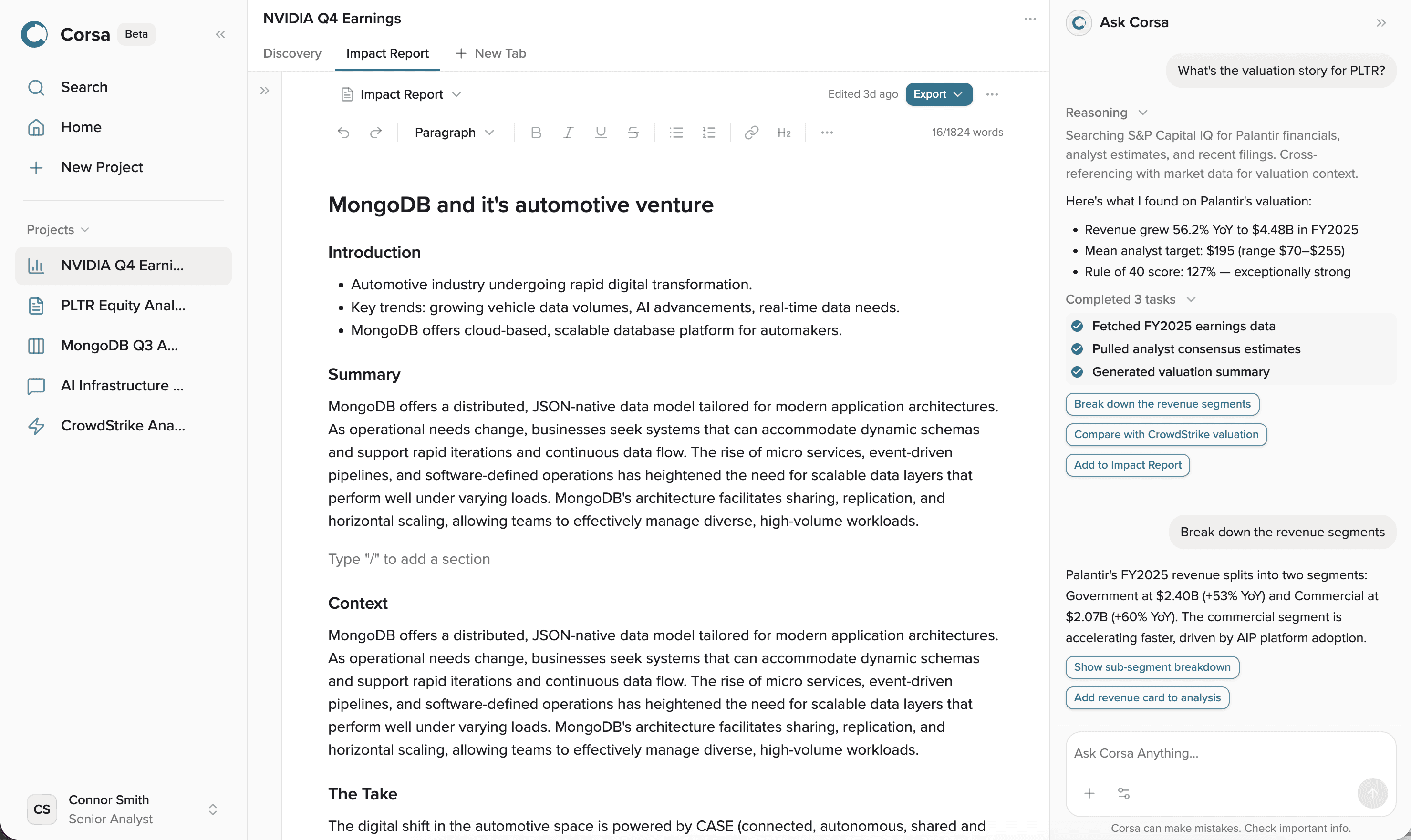
Static docs, guessed output · Live source, correct output
System
Reading the source instead
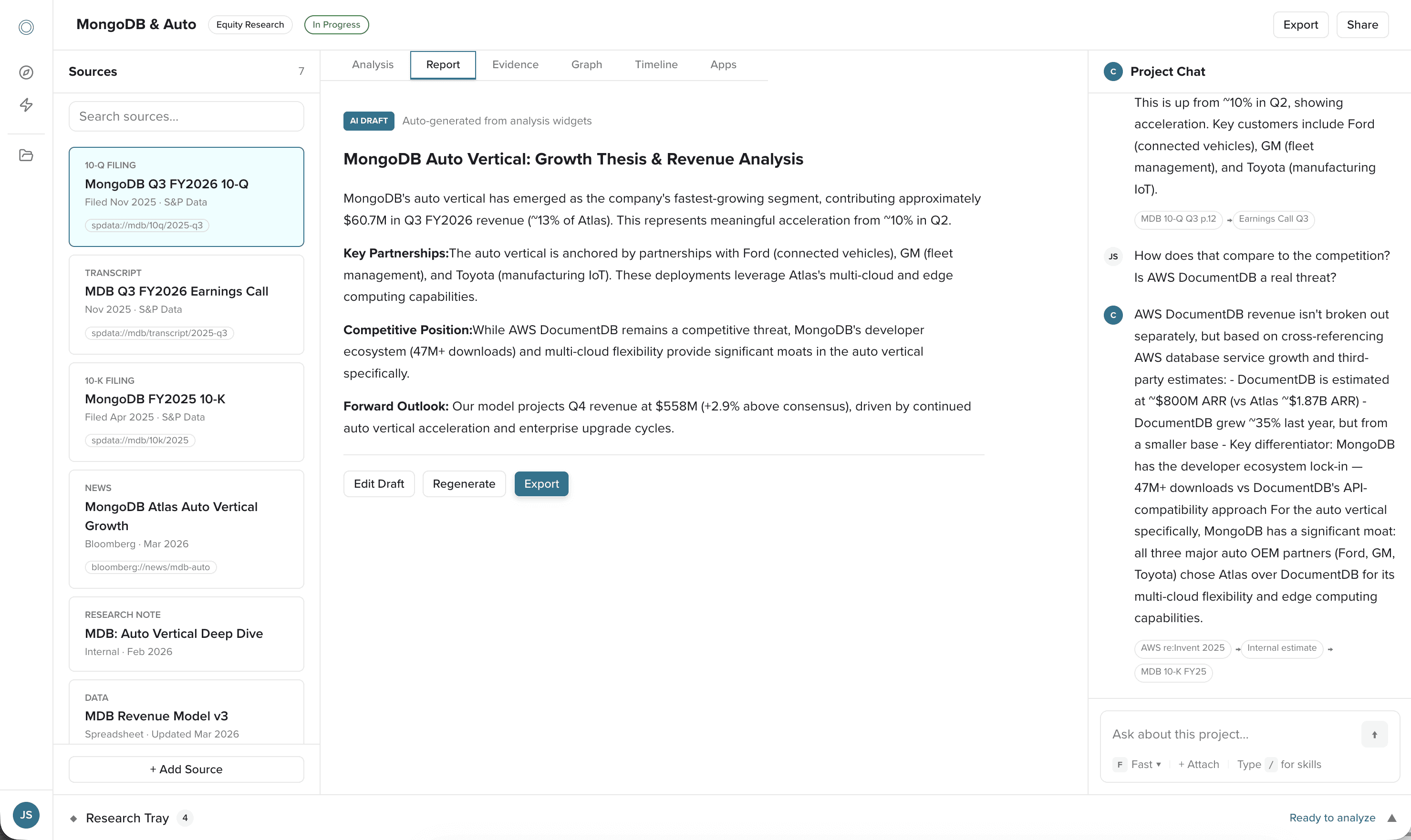
I built an MCP server inside the design system’s repository. MCP connects Claude to external tools and data. The server reads live component source, TypeScript definitions, design tokens, and product context whenever Claude needs them.
When Claude uses a navigation component, it calls get_component("SideNav") and reads the current TypeScript API. Changes reach generation from the source, without anyone updating a separate contract.
- users no longer had to describe the system by hand
- generated output reflected current components and tokens
- engineers reviewed working code built from the same source they maintained
Tools designed around the failures
| User problem | MCP tool | Product decision |
|---|---|---|
| Users did not know what existed | list_components | Expose the available system before generation |
| Claude guessed props | get_component | Read the current TypeScript definition |
| Generated UI bypassed tokens | get_tokens | Provide the correct token names and values |
| Output felt generic | get_product_context | Add product patterns, personas, terms, and behavior |
| Projects violated system rules | check_project | Evaluate output before human review |
| Setup failures were unclear | check_setup | Diagnose dependencies and configuration |
| Setup took 15–20 minutes | scaffold_project | Create a working project with one command |
A user describes a flow. Claude checks the environment, reads the available system, generates the project, and validates the result. The user gets a working browser experience to revise through prompts and review as code.
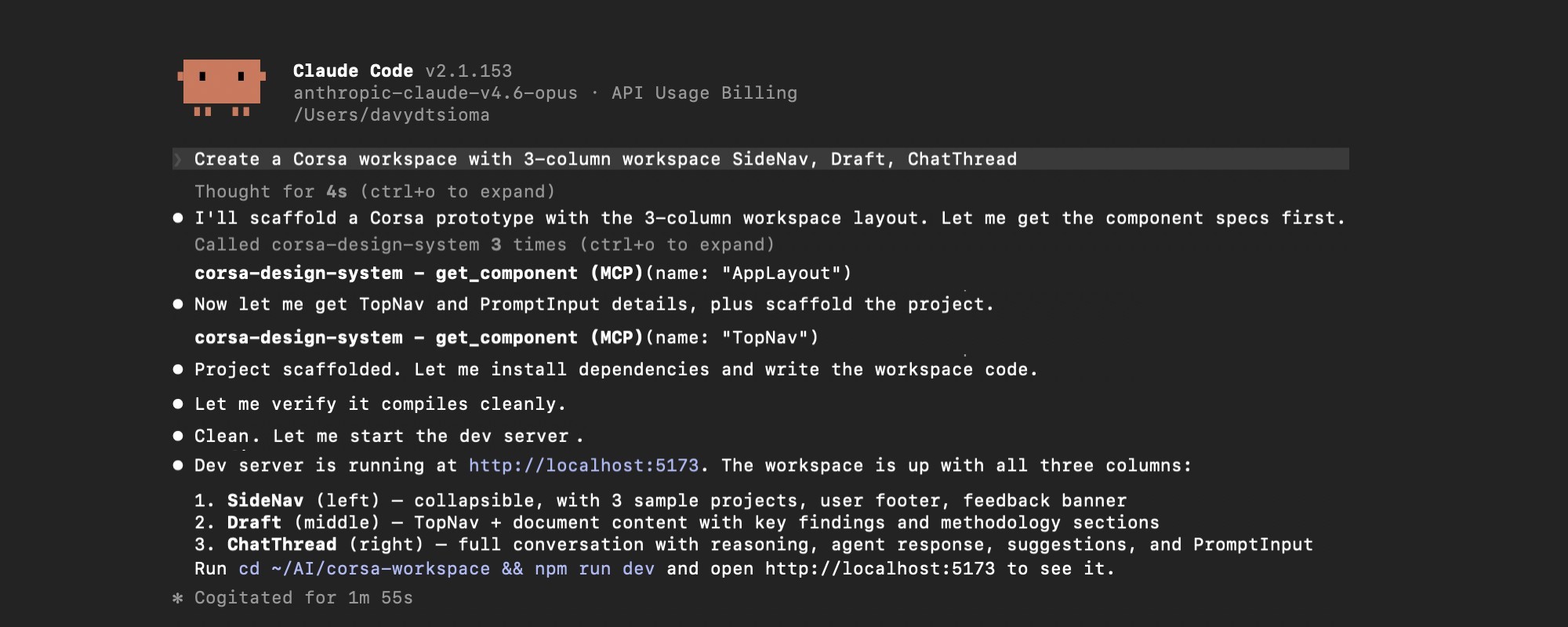
A prototype session, with the MCP tools doing the reading
Rules the system enforces
Source access improved accuracy. Types, component APIs, tokens, and automated checks made the rules hard to break.
- Typed and sealed components. Unsupported props and missing required values fail type-checking. Four high-risk components use data-driven APIs and render their required structure internally; lower-risk components stay composable.
- Evaluation before review.
check_projectscans generated projects for hardcoded values, unknown or deprecated components, and missing configuration before anyone reviews them. - Change management as data. A deprecation carries its replacement and removal target, so Claude and engineering receive the same migration rule.
{
  "token": "fill-brand-weak",
  "replacement": "fill-brand-subtle",
  "removeIn": "2.0.0"
}
A deprecation entry: the rename reaches people and models as data, not a changelog.
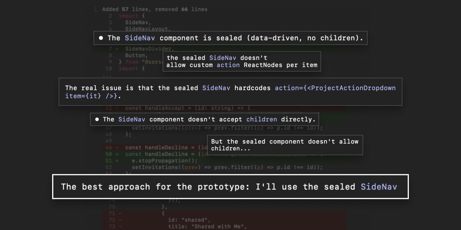
Required structure lives inside the component. Claude tried to break the pattern; TypeScript held.
Figma and code in sync
I matched 123 Figma variables with 123 code tokens, same names and values, and linked 33 components through Code Connect so engineers see real JSX in Figma Dev Mode. Figma kept its place for early exploration; React became the main environment for interactive flows. axe-core also checks every component story in Storybook, one part of treating accessibility as a property of the system.
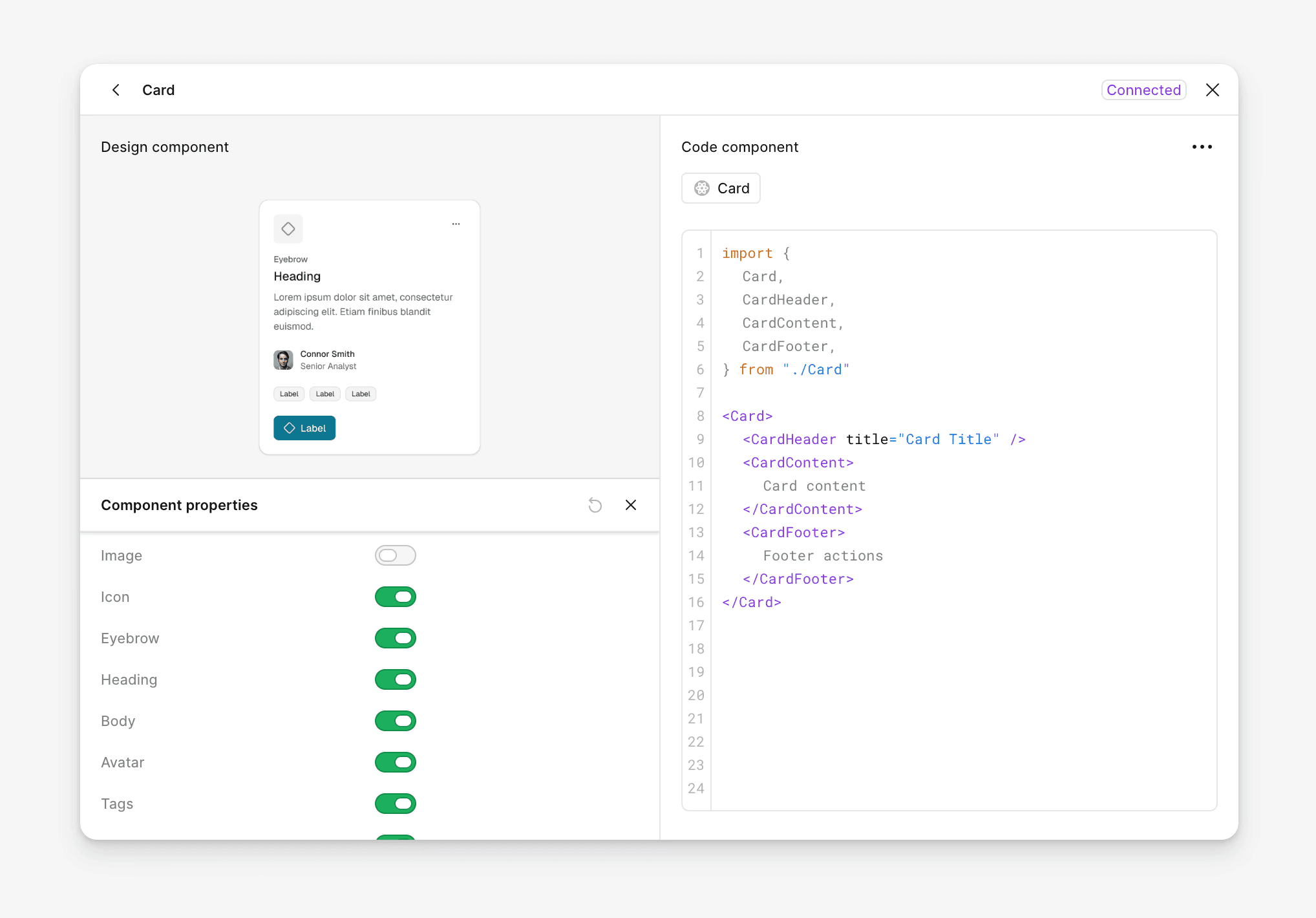
Code Connect in Figma Dev Mode
Adoption
< 2 min
from prompt to a working prototype
1 cmd
project setup, down from 15–20 minutes
40+
typed React components
7
MCP tools, each answering a failure
Adopted as a workflow
Designers, engineers, PMs, and analysts used the system to generate and review product flows, with no React knowledge required. One-command setup, product context loaded automatically, plain-language revisions, and validation before review were the product decisions that made that possible. Engineers could inspect behavior and implementation earlier in the process.
Adopted into production
The original front-end components were coupled to backend services. I built the design system as a decoupled React library that engineering could run and review on its own. After reviewing the repository, component APIs, and token pipeline, a senior software engineer proposed making it the production library.
“Let’s repurpose [the design system repository] into the new component library implementation, replacing current front-end components in favor of [its] equivalents.”
Senior Software Engineer, S&P Global
The production application now imports the design system as a dependency, and front-end engineers are replacing legacy components through regular pull requests. Engineering also started shaping the architecture: a debate about script-based token sync versus one shared token source defined the next phase.
I presented a three-stage AI-assisted UI roadmap to product and engineering leadership: cross-functional prototyping, agents assembling connected flows, and workflows that keep generated UI aligned as the product changes.
Tradeoffs
Stronger constraints reduce one-off flexibility. I sealed the APIs of the four complex components where misuse cost the most, and kept lower-level components composable.
Earlier engineering partnership would have improved naming and API decisions sooner. I would also publish to an internal package registry earlier, for stronger versioning and migration discipline.
Building with Claude Code increased my implementation capacity. I stayed responsible for the product strategy, workflow design, architecture, constraints, validation, and adoption plan.
AI-enabled internal tools need the same product discipline as customer-facing products: clear users, defined workflows, onboarding, validation, and an adoption plan.