How I work
Design systems
A system is the set of rules a team can’t forget. I build them so the rules live in tokens, types, and review, not in someone’s memory.
History
Four systems, one direction. I have built a shared system at each of my last four companies. Each one moved the rules a little further out of people and into the system itself.
| Company | What the system was | What it taught |
|---|---|---|
| Coalition | A marketing design system that absorbed an acquired brand in under two weeks | A system, not a redesign, is what lets a team ship the next fifty pages |
| Kontron | 40 components in three months, the company’s first shared library | Speed comes from shared parts, not faster designers |
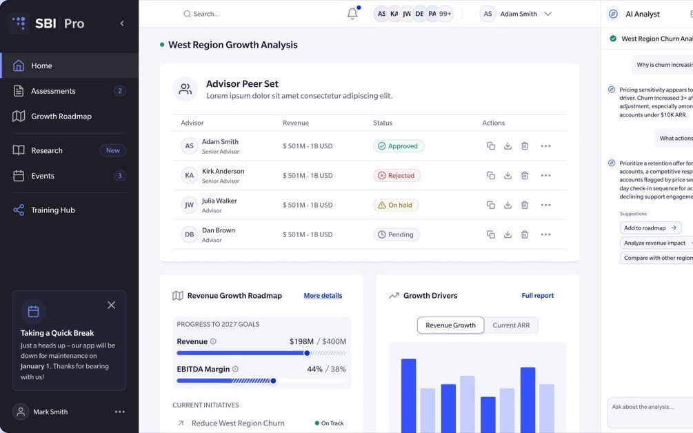
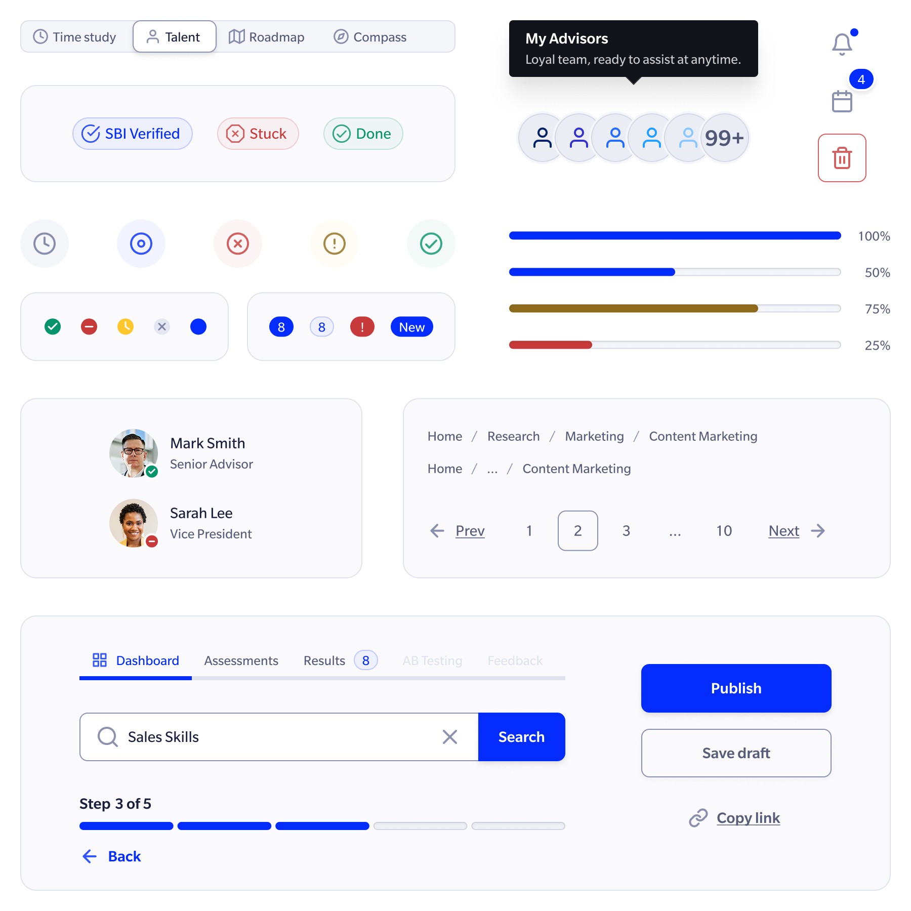
| SBI | A 40-component system across two products, tokens first, light and dark | Semantic tokens carry decisions like contrast and theme into every component |
| S&P Global | An AI-native design system: 40+ typed React components, synced tokens, and MCP tooling | Rules in code beat rules in documentation, for people and for models |
50%
faster design-to-delivery at Kontron
30%
faster design-to-production at SBI
123
Figma variables matched to code tokens
1
library adopted into production
Tokens
Tokens before components. Shared primitives come first: color, type, spacing, radius. Themes and modes live at the token layer, not as overrides on individual components. At SBI, light and dark analytical environments were token sets over one component library, so a component never needed to know which theme it was in.
Scope
Standardize repeated behavior, keep the rest local. A pattern earns a place in the system when it repeats, when inconsistency is expensive, or when it carries a rule people tend to miss. Everything else stays a one-off until it proves otherwise. SBI kept different navigation structures and data densities local, because forcing them into one component would have hurt usability and pushed teams to work around the system.
Vocabulary
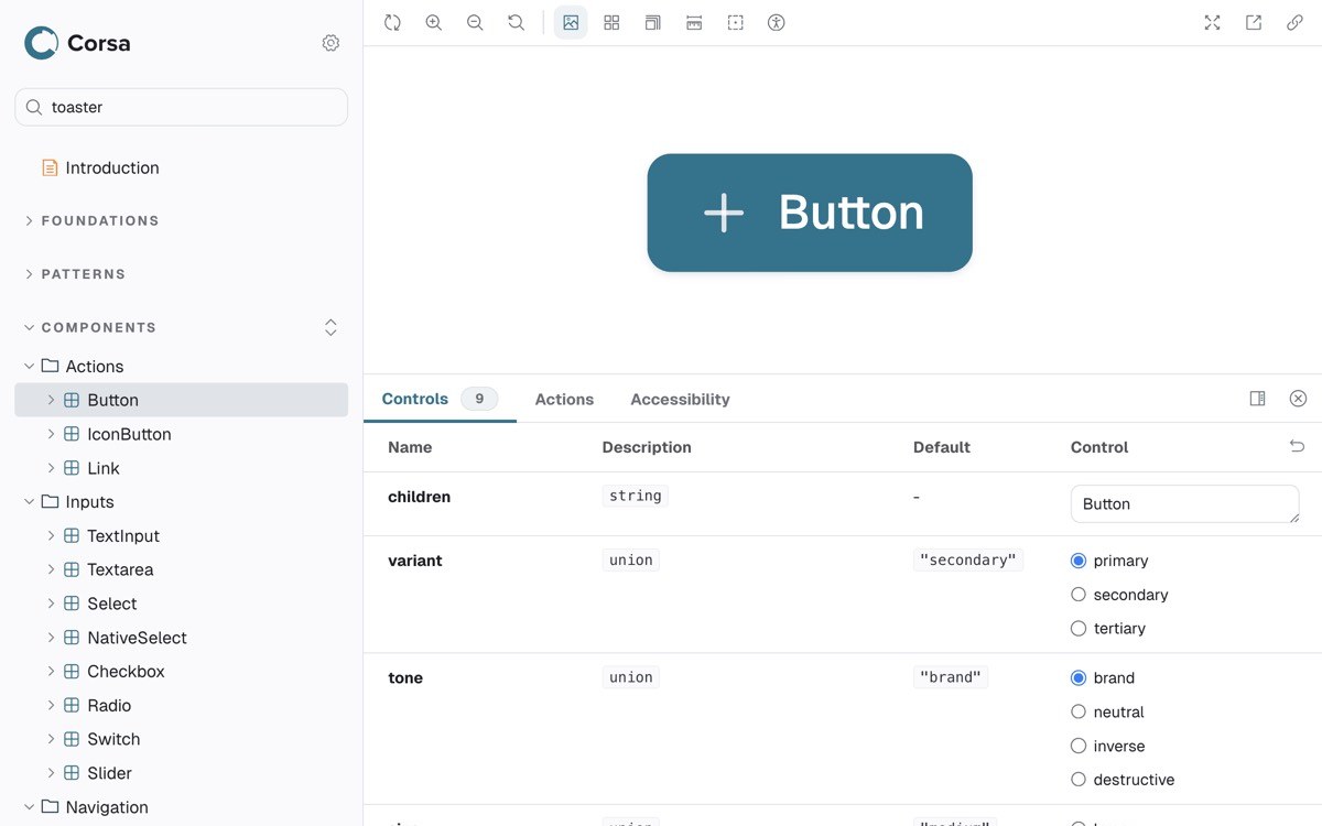
One vocabulary for design and engineering. The same names in Figma, CSS, and code mean nobody translates. At S&P Global I matched 123 Figma variables to 123 code tokens, same names and values, and linked 33 components through Code Connect so engineers see real JSX in Figma Dev Mode.
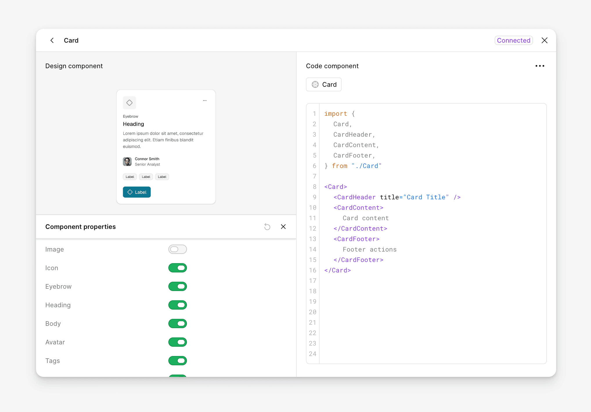
The component in Figma shows the code engineering actually imports
Accessibility
Accessibility is a property of the system. Most accessibility failures are not ignorance. Most designers know the 4.5:1 rule. They happen because the system does not carry the rule, so every new screen starts the check over, and under deadline the check does not happen.
When a token passes contrast, every component using it inherits the result. When axe-core checks every component story in Storybook, violations are visible before review. When one shared dismiss button is raised to the WCAG 2.2 minimum of 24×24, the fix reaches Toast, Alert, Dialog, and Popover at once. That single fix is the whole argument for building accessibility into the system.
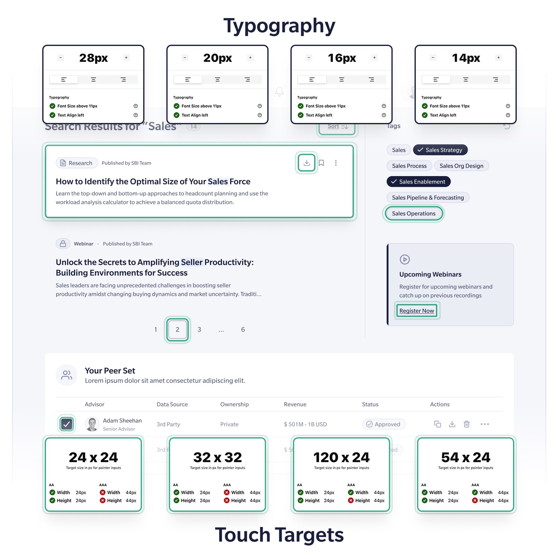
Type and touch-target checks carried in the SBI system
It also means naming the limits. I test every data-visualization palette with ΔE2000 across three types of color-vision deficiency. When a pair cannot be separated by color alone, the rule is that it always carries a second signal, like a label or a pattern. A documented limit with a mitigation is worth more than a clean pass that isn’t true.
Rules
Encode the rules instead of documenting them. Types stop wrong usage. Sealed components render their required structure themselves. Deprecations ship as data with a replacement and a removal target, so the change reaches every consumer instead of a changelog nobody opens.
{
  "token": "fill-brand-weak",
  "replacement": "fill-brand-subtle",
  "removeIn": "2.0.0"
}
A deprecation in the design system: the rename reaches people and models as data.
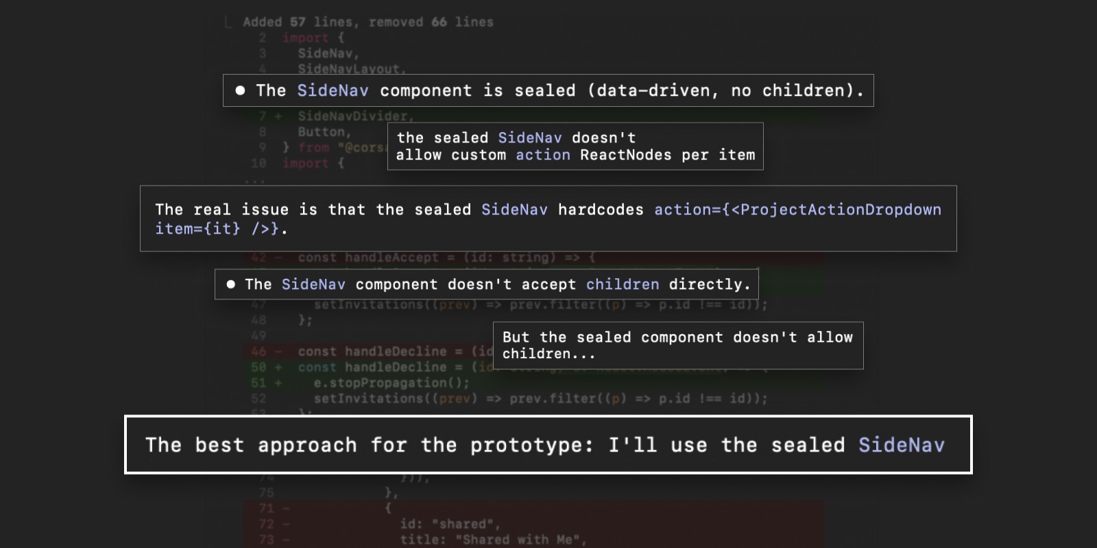
The rule lives in the component, so breaking it fails to compile
Governance
Governance that survives the person who built it. Experiment freely, promote deliberately. A new pattern moves from a need, to a prototype, to validation, to review, and only then into the shared library. Prevent drift with types and tokens, detect the rest early, and fix the clear cases safely. Accessibility and theming run as planned programs; small fixes ride along with feature work.
The test of a system is not the day it launches. It is the day other people start improving it. At S&P Global that happened when engineering proposed making the design system the production library and began shaping its architecture.
Impact
A system is business infrastructure. Coalition folded an acquired brand into its website in under two weeks because the section patterns already existed. Kontron’s first shared library cut delivery time in half. SBI measured a 30% faster design-to-production cycle across comparable Jira stories once the shared foundation was in regular use. None of those came from a better-looking button.