S&P Global · 2025–2026
S&P Global: An AI-Native Design System Adopted Into Production
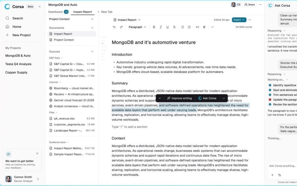
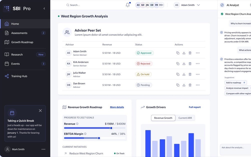
I was hired to evolve S&P Global’s AI research platform and overhaul its design system. I rebuilt the system in Figma and React and made it the foundation for an internal AI prototyping tool. Anyone, from designers and engineers to PMs and analysts, could build working prototypes on the real components without learning the system’s rules, because the system enforced them. Design review moved from static mockups to working screens, and my component updates reached production through a flow engineering reviewed and approved.
Context
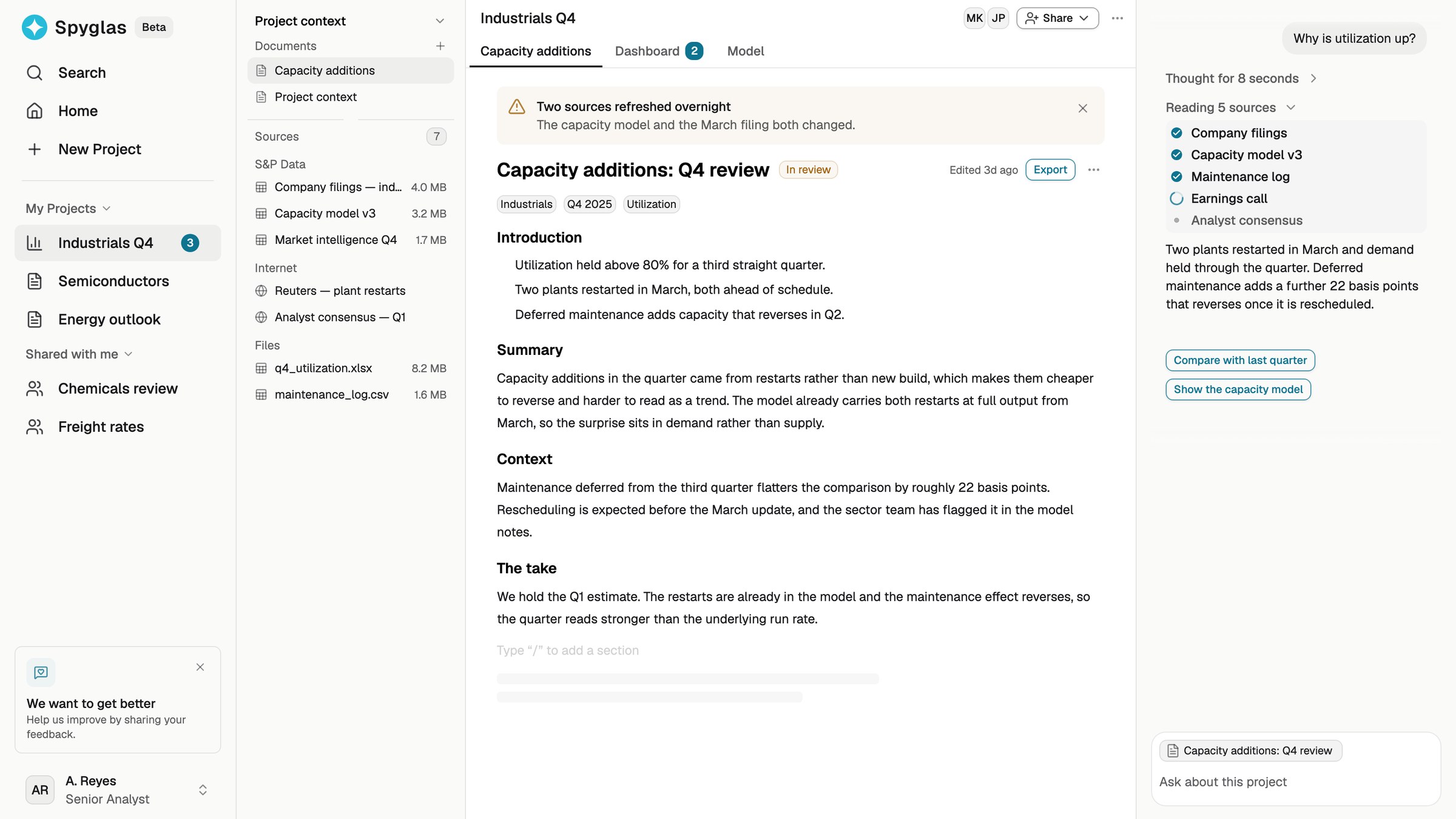
I designed the product experience of an AI research workspace (opens in a new tab) for S&P Global analysts and built the system beneath it. This case is about the design system and the prototyping tool built on it, which teams used to create, test, and implement that experience.
What I inherited
For the first month I worked on the product while learning how people actually used the existing system. Four problems kept coming up:
Out of sync
Figma components didn’t match the ones in production, so designs drifted at handoff.
Broken composability
Basic building blocks were missing, so designers built one-offs and picked colors and spacing by hand.
Confusing components
Color names were confusing and variants were missing or hidden, so designers couldn’t tell what to use.
Blocked updates
Designers detached components to get what they needed, which cut them off from system updates.
I ordered the fixes by reach, and kept product work going the whole time: tokens first, then the missing basics and the most-used components, then engineering review, then a gradual migration in production.
The goal became one shared system that design and engineering could both work from.
Foundation
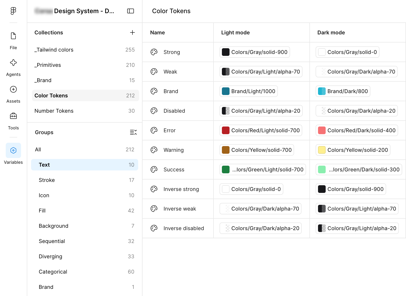
Tokens came first, because one change there reaches every component. One level of tokens became four, with brand and light/dark on separate axes, so components never need to know which brand or theme is active. Every name reads element, intent, emphasis, state, like fill-brand-strong-pressed, so it is clear which color to apply.
Then I filled in the missing basics and rebuilt the most-used components, with variants and states as properties in the panel, so designers could see what existed instead of detaching to get it.
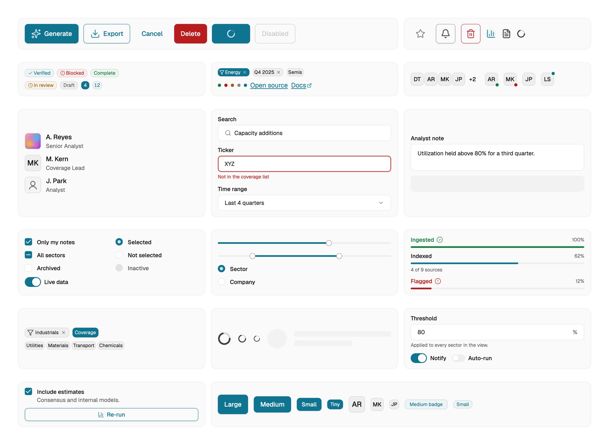
Tokens and components
The deeper architecture, from token layers and theming to accessibility and governance, is on my design systems page (opens in a new tab).
Parity
One component, two tools
Figma component properties match the React props: the same names, variants and states on both sides. Storybook controls are generated from the TypeScript props, so a designer reading the Figma panel and an engineer reading Storybook see the same API.
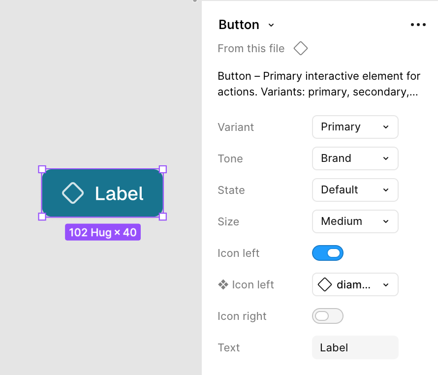
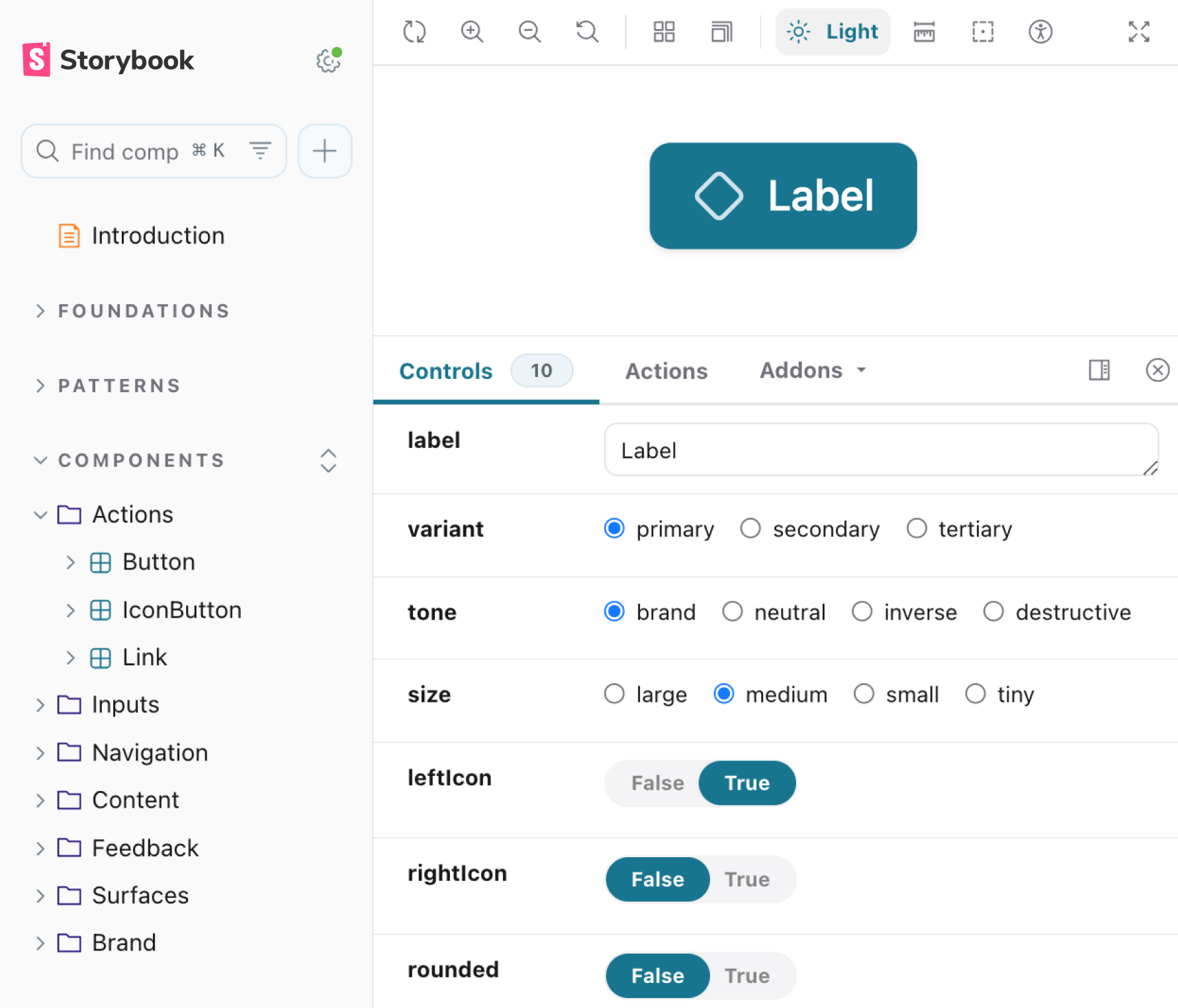
The same Button in both tools
Code connected to the design
I linked the Figma library to the React source with Code Connect, so a component in Figma shows the code engineering actually imports, with its real props.
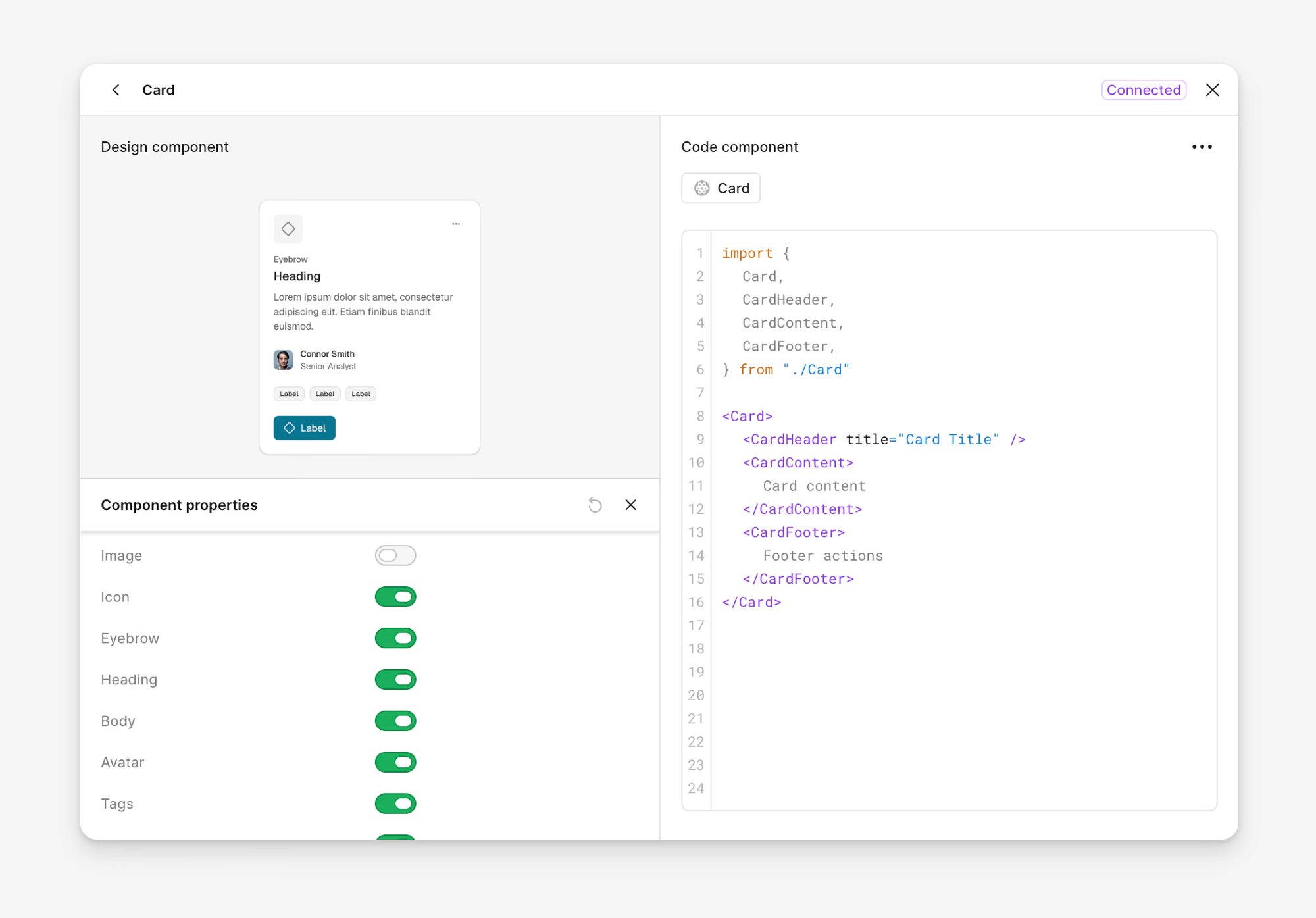
Code Connect in Figma
A name means the same thing in Figma and in the code.
Production
Taking the translation step off engineering
Every Figma update still had to be rebuilt by engineers before it reached production. To speed that up, I proposed writing the component code myself with AI. Engineers doubted the quality of that code.
I tried it anyway. Design would own production behavior and animation instead of only describing them, and updates would no longer wait in an engineer’s queue. I branched the production React library and updated components one at a time: Figma first, then Claude writing the matching code, then Storybook as the check. Nothing was renamed or reinvented, so each change could go back as an ordinary pull request.
When I showed engineers the results in Storybook, the doubt turned into review: missing states, naming and APIs. I took most of it, and the pull requests were merged.
A flow for system updates
That made me the system’s maintainer, in Figma and in code. I proposed changes, front-end approved every merge, and fixes, breaking changes and new shared components each had their own path. Old components were migrated in order of how hard they were to swap: checkbox first, then dialog, tables last. The full process is on my design systems page (opens in a new tab).
Adopted into production
After reviewing the repository, component APIs and token pipeline, a senior software engineer proposed making the design-side branch the production implementation instead of maintaining two libraries. The production application now imports the design system as a dependency, and engineers are replacing legacy components through regular pull requests.
Design took on the translation work, and engineering kept the final say.
Prototyping
With AI, the design team started building prototypes in code. But the AI made up its own components, so engineers still rebuilt every prototype from scratch.
I wanted prototypes built from the production components instead. A prototype would then use the same components, props and tokens that engineering ships, so handoff would mean reviewing working code, not translating a picture. The system made that possible: design could already update components, and all the basic pieces existed.
If a prototype is built from the real components, handoff starts from working code.
System
Four errors kept coming back
The library alone wasn’t enough for the AI. Reviewing prototype sessions and generated output, I saw the same four failures again and again:
Guessed APIs
The AI guessed props: some didn’t exist, others had values the component didn’t accept.
Invented components
When it could not find a pattern, it created one that did not exist.
Hardcoded values
Generated code bypassed semantic tokens and drifted from theme and brand rules.
Missing patterns
Required structure or behavior was left out, creating fragile interactions and accessibility issues.
Setup added friction too: 15–20 minutes per project, and product context explained again in every session.
The AI couldn’t see the real components, so it guessed.
Documentation drifted
My first fix was a written guide for each component: its props, required patterns, tokens and common mistakes. The AI got better, but the guides fell out of date. When a component was updated in the code, its guide still described the old version, and the AI followed the guide. I tried two more approaches:
| Iteration | Improvement | Limitation |
|---|---|---|
| Written guides | Exposed component rules during generation | Drifted from implementation |
| Hook enforcement | Caught known errors after generation | Still depended on copied rules |
| Richer context | Improved product awareness | Added maintenance and token cost |
Reading the source instead
Every approach relied on a copy of the code, and a copy drifts as soon as the code is updated. So I connected the AI to the code itself.
I built an MCP server inside the design system repository. It gives the AI live component source, TypeScript definitions, tokens and product context, through seven tools across four jobs:
| Stage | Tool | What it returns |
|---|---|---|
| Setup | scaffold_project | The project, pinned to the versions the library needs, with the server wired into it |
check_setup | What the environment is missing, and the fix for each thing | |
| Understand | get_product_context | Product terminology, users, principles, accessibility rules |
list_components | The components that exist, and what a project needs to run them | |
| Build | get_component | Props parsed from the component source at the moment of the request |
get_tokens | Semantic tokens and the CSS variable names that carry them | |
| Validate | check_project | Where a project drifted from the system, with a fix beside each finding |
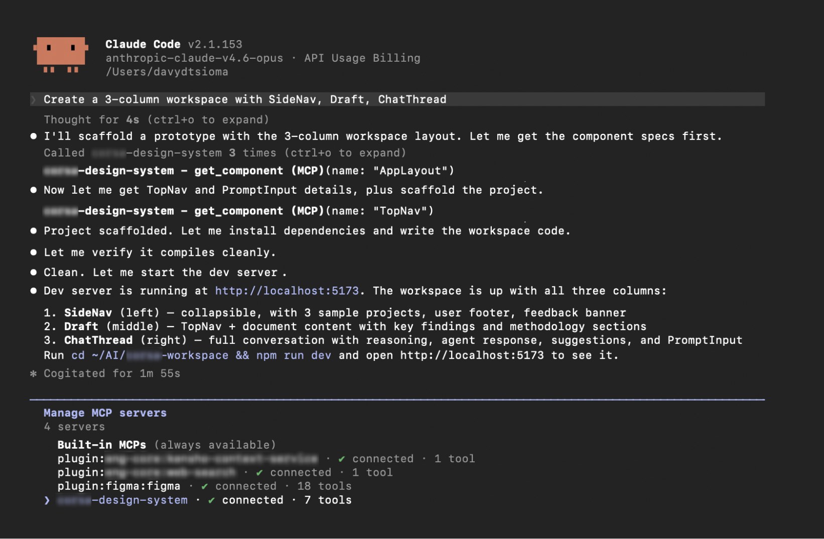
One session, start to finish
Enforcement where errors were expensive
Live source reduced drift, but it wasn’t enough on its own. Typed APIs, token checks and a final project check send anything off-system back to the AI to fix. Four components were sealed: side nav, top nav, prompt input and chat thread. The team had agreed on their structure, and the AI kept rearranging it anyway. A sealed component takes only data and renders its required structure itself.
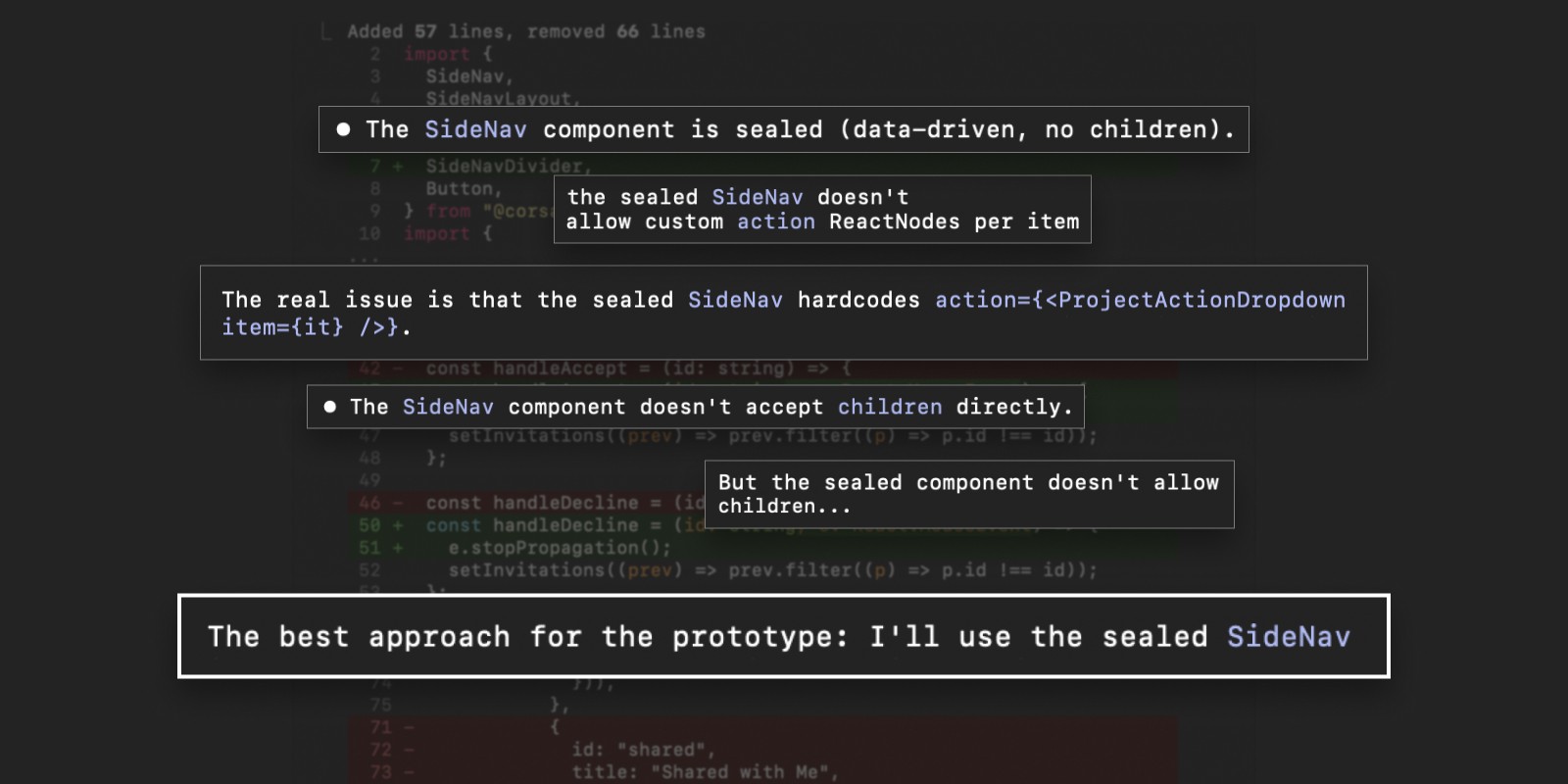
The type check holding a pattern
Strict where mistakes were expensive. Flexible where exploration mattered.
Together, the source and the checks change what the AI builds. Here is the same workspace without the system and with it. The “without” version is a demonstration of the four failures, not a captured run.
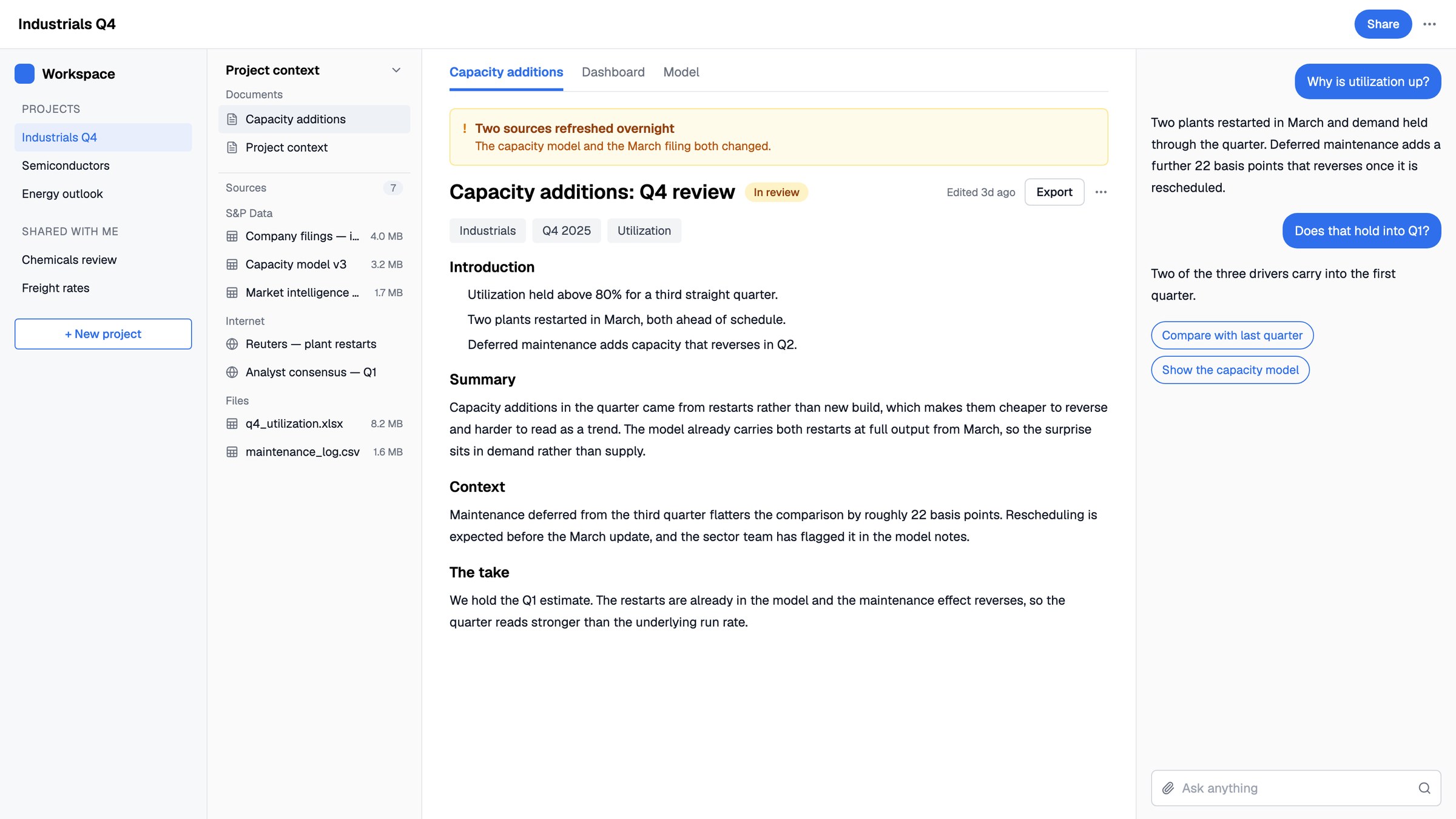 Without the systemWith it
Drag to compare
Accessibility
The system targets WCAG 2.2 AA, and the rules live inside the components: focus rings from a token, labels and error wiring in form controls, 24px minimum targets, and reduced motion respected. Generated screens inherit all of it.
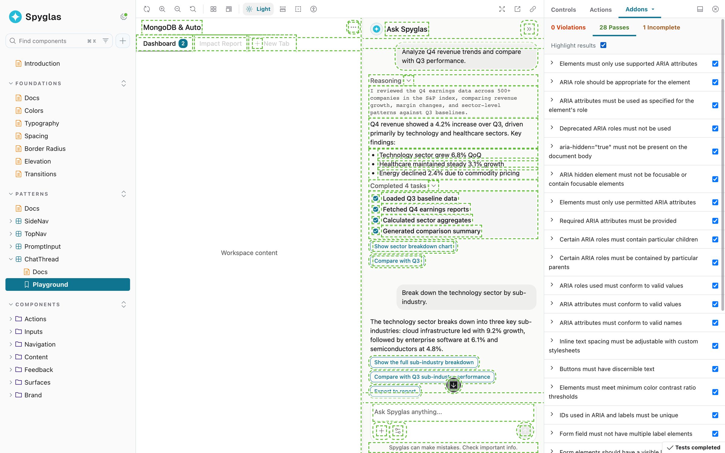
Checks beside the component
The miss the token layers made cheap to fix
I built the first token values from production colors the team believed were accessible, and didn’t check them myself. Designing the chart colors exposed it: the palette failed contrast and color-blindness checks, because the colors had drifted away from Tailwind CSS (opens in a new tab) in search of a custom look.
I added Tailwind, the palette engineering already used, as the bottom token layer and pointed the primitives at it. Every component picked up accessible colors with none touched, and the contrast check now sits on the token.
The token layers turned a system-wide accessibility failure into a single change.
Sharing
Sharing a prototype took one request: a script added it to the shared repository, the gallery and the flow map, with comments turned on, so anyone could see where design was going.
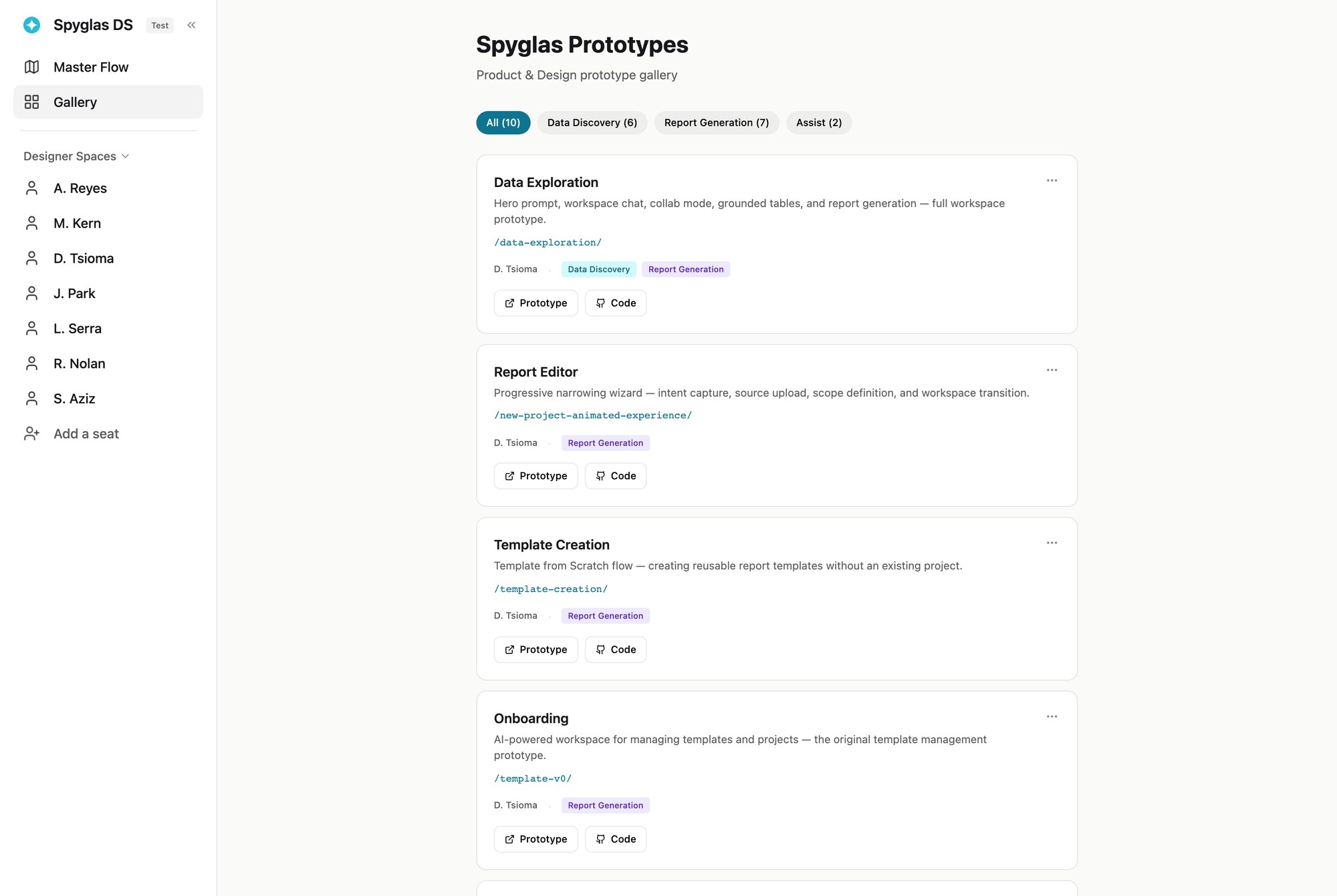
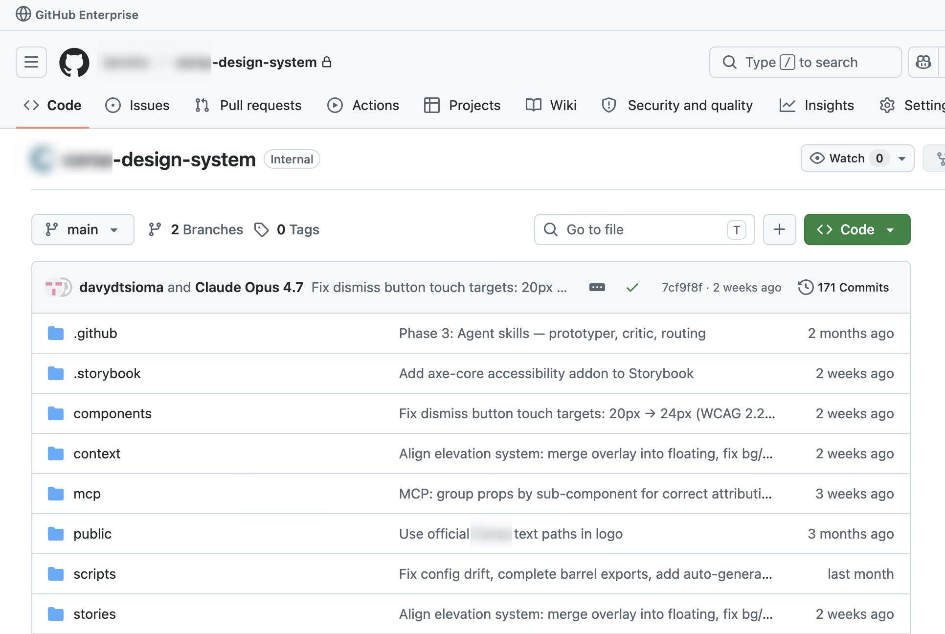
The gallery and the repository
I have since rebuilt the comments (opens in a new tab) and the flow map (opens in a new tab) from scratch as open-source tools for coded prototypes.
Adoption
Anyone can build
Designers, PMs, analysts and engineers built working flows in plain language, with no React setup.
Rules enforce themselves
Checks send anything off-system back to the AI, so nobody has to know the rules to follow them.
Review in real code
People reviewed real screens instead of mockups, so far less was translated at handoff.
30+
people building on the system
1 cmd
project setup, down from 15–20 min
< 2 min
from prompt to working prototype
Generation became reliable when the design system itself became machine-readable, enforceable, and shared with production.